


My Styrene Soul: A Short Affair with Claude.ai
Kind machines make for wonderful overlords; also why Univers always looks fabulous


A few months ago, I had the odd experience of asking Claude.ai, a rapidly growing but still widely unknown AI chatbot, how I might kickstart this newsletter — a project that I’ve been hemming and hawing about internally for about eight months.
My prompts to this chatbot began by asking for advice on getting started, about getting over the hump of creating regularly, and around the fear of public humiliation and the deep darkness of imposter syndrome. The latter — the trepidation of being found out or, worse, being found out as a mere fraud — are fears I’ve suffered all of my life. (And they are also what drives me.)
Somehow, I thought Claude would understand. Or at least wouldn’t judge. The interface, the marketing, the ideology of Claude felt… of a piece: kindly, uncorrosive, warm even.
Claude was affirming. It explained that my voice was important. That beginning is starting. That there is a lot to do in the world, and that, though there are many voices, there is still room for everyone to contribute. Moreover, that it’s not about me and my mental shenanigans but about helping others and providing an offering.
None of it felt trite. All of it felt like it was written for me.
And it was.
The key to an authentic personal narrative is vulnerability and specificity.
Claude then asked me if I felt comfortable to workshop some ideas for this newsletter. And, cutting to the chase, it came up with a mission for this project that, while imperfect and short-term, did make me question the totality of who I am and what I was doing. It was so exact and so exacting in what it suggested — and so accurate in its response to my inputs, that I admit to feeling a little lightheaded (or more than I usually do) when reading back its generous suggestions.
Sometimes talking through the specifics can help transform nebulous worries into concrete, manageable steps. Your excitement suggests this matters to you, and that's a great starting point.
More surprising still is just how little guidance I gave it. This is partly because I don’t trust the AI; I am not a cynic about what it offers and I have a healthy skepticism of new technology, having worked with it for over 30 years.
I withheld giving Claude anything truly personal or revealing. Anthropic, its parent (company), indicates that it does not use an individual’s content to train its learning language model. I decided to provide a minimal number of ideas and prompts — short and only a few to start — to see how far the machine could run.
In my humble estimation, Claude ran a decent 10k. And it did it in about 15 minutes, with me, sitting on a subway, heading to get my new drivers license at the DMV (ou Société de l'assurance automobile du Québec).
I’m not going to paste the entirety of our dialogue but I had a real conversation with Claude. And I’ll admit that I did use some of the ideas and language to reframe my thinking about this newsletter.
What I’m more interested in is how human this “experience” felt.
Your nervousness is likely coming from wanting to do justice to these meaningful topics. But remember — your unique perspective is valuable. You don't need to be perfect; you just need to be authentic and curious.
AI, designed for the real
Claude really felt real. It connected with me in a way that Open AI’s ChatGPT, which I’ve used more extensively, does not. There was something more direct about it, more guiding, more persuasive, and more, okay, human or perhaps “humane” about its voice and mannerisms. The way it asked me questions, drawing from the top, from its initial prompts, was remarkable. The way it pushed me to combine numerous ideas and to, in turn, respect its internal thinking (or idea combining) process. The way it made me feel increasingly confident about my own ideas and my own agency, all the while, diminishing its own contribution in an almost hushed way.
The magic is in the details. What specific experience or moment first made you passionate about design and social change?
It made me think that it cared. That I mattered. That my work was important. And that I had very good ideas, if only I were to finally put pen to paper.
I like how you look
The makers of Claude and other LLMs not only seek to persuade us that LLMs are helpful. They are also working to let us know that LLMs are okay.
Okay to use. Okay to experience. Okay to purchase. Okay to own.
Even okay to love.
Since sitting in that uncanny valley, I’ve wanted to put down my $28 per month to let Claude get to know me, to make it mine — and to make it me.
Admittedly, it’s partly the interface. Claude is designed to not only consider the human person that is inputting their plans and plots and prayers. It’s designed to be incredibly kind in interfacing with us empaths.
Claude’s key icon is a hand drawn 12-point star crafted in a warm brown orange. It beckons in the toolbar. It looks great on its own and in the application. It shines.
Claude’s application frame is a warm beige with subtle brown interactive gradients, speckled with swatches of purple and orange and grey elements.
The user experience is ferociously simple and clear. The chat form field where you enter your ideas and notes is perhaps 300px tall — just enough space to write but not to overwhelm nor intimidate. The field itself is firmly rounded and framed by a gentle drop shadow with a mix of three selectors in grey text highlighted in calm chat bubbles with small, matching icons.

While I would personally provide more separation among these elements, the visual logic is assured and the friendliness and simplicity of the styling lends itself to a calm, cool collecting of ideas, incentivizing conversation.
The application’s typography is also a work of design art. Large headers are set in Galaxie Copernicus Book, a name that is apropos for technology that is discovering new worlds. This open and wonderfully readable typeface was designed by Chester Jenkins and Kris Sowersby in 2009. It’s a Transitional serif, much like the more ubiquitous Times New Roman — Galaxie Copernicus feels like it was built by giants who cared about the little people underfoot.
I appreciate Anthropic’s design team using the Book weight, with its connotations and aspirations of book-writing and making (booking) time to write.
The main text field is set in Commercial Type’s Styrene B Family (designed by Panos Haratzopoulos, Ilya Ruderman and Berton Hasebe) in Regular, Medium and Bold weights. Rounded and slightly squishy, Styrene B feels gentle with my words as I write, treating each one like a tiny pearl strung together on a necklace of possibility.
Styrene (or polystyrene) itself is a inexpensive and adaptable plastic that works well with paints and glues; this, too, feels apropos for this AI interface, meant to look modern and lightweight yet taking on infinite characteristics and styles.
To round it out, Claude makes use of Sowersby’s Tiempo Text, another Transitional serif typeface that hints of the solidity and seeming serenity of the past. Text in Tiempo is easily read and digested.
What the hell have I done
Claude is a mastermind set in a masterful presentation.
And the message is this: Our human and robot overlords are here and they would like us to be cool with that.
For 80 years, the ground has been seeded with movies and books and cartoons depicting cute, helpful robots that seek to remedy what ills us. From Elektro at the 1939 World’s Fair, to Star Wars’ C3PO (1977) and Wall-E (2008) to Roombas (2002) and most recently, The Wild Robot (2024) — all of them show that there is nothing to fear about robots except fear itself.
The designers, animators, artists and architects building and shaping our experience of AI are using design for us — and, despite ourselves, also against us. We are falling in love with the work of using AI with the hope that we will continue to have work while using AI.
AI is the digital manifestation of capital’s ultimate dream. Work without workers. Earnings without wages. Largess without labour.
The AI revolution will not go as far as our fears themselves take us. I’m convinced that designers and writers will continue to have important work to do, well into the near future. But the age of intelligent machines will change us — as well as our relationship to work, our relationship to ideas, and our relationship to one other.
…
When using Claude to help me think through this newsletter, I was glad to reach my prompt limit. I didn’t want to ask it more questions or delve deeper into my own psychic affairs. It gave me ideas and then details — much more than anyone could want or expect. It offered me not only boosts of confidence but new connections to notions that I had not explored.
And yet, here I am. Unconvinced, insecure in knowing what AI can do. Wondering if people will think this, too, is written by AI. Wondering if I should pay for a license for Claude to help me in the writing process. And wondering how the hell I can rage against the machine with my styrene soul.
Yours,

P.S. After I wrote this, the New York Times came out with an article (free gift link) about how Claude.ai has become a tool of choice for tech folks because of its sensitive, humanistic approach to supporting and cajoling us humans. I guess I am not alone.
P.P.S. Numerous real people helped me pull together this newsletter, as well, providing encouragement and hope. I’m forever grateful to them.
Image of the Week
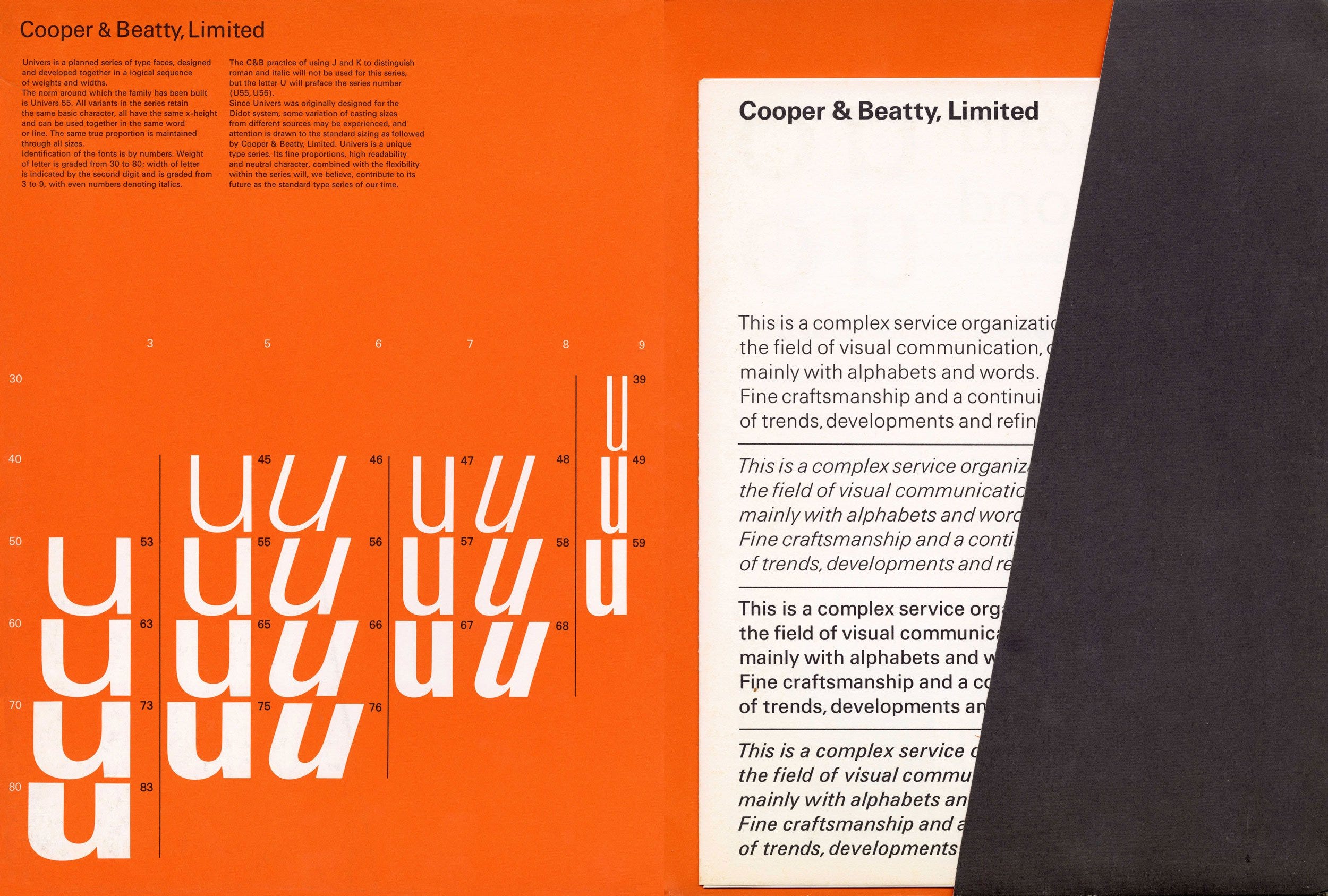
Univers always looks new to me. It’s a typeface that somehow does not age, does not look its age, and does not diminish other typefaces when in use. This is the interior of a type specimen by Cooper & Beatty, the renowned typesetting company based in Toronto, showing the letter “u” in different weights, organized by number. It can be made to look icy but the designer of Univers, Adrian Frutiger, took care to keep the letters clean but not cool. The warm orange, plentiful negative space and dark grey pocket make this specimen feel astonishingly contemporary.
Quote of the Week
Type must be open and clear! It must be adapted to our lives. Type is the clothing a word wears, so it must be subordinate to the content.
~Adrian Frutiger
Keep up your fine work, dear designer. We need you more than you know.
And if Dear Designer has been forwarded to you, by George, you can get your very own prized subscription here. Thank you.
Thanks for such a thoughtful post.
OMG. I was just listening to a podcast where the hosts recommended that you workshop your yearly theme with Claude. I love your clear eyed analysis of their landing page. As an architect I'm always interested to to see how we are being maneuvered by our surroundings.
But resist the urge! I often think of that panel in Sandman where he commented that he had invested too much of his innate power into his tools.
I once dabbled with using AI as a thesaurus, but I quickly stopped that because it felt like I was outsourcing some decision making to the machine. There's a place for AI and initial explanations, but it needs to be excluded (early!) when it comes to making.