Dear Designer,
In the last issue of Dear Designer, I argued that not only is the continued mass use of photography a scourge on the planet — but that designers should consider refraining (or even reframing) their use of it.
Yes, there is a bit of a modest proposal here.
I do not expect photographers to close up shop, for designers to walk away from their smartphones, or for communications professionals to employ hand-illustration for every project.
However, photography is and will continue to be a real challenge for us. More servers, more energy, more computing power is used every single day to store, manage and deliver these images online. Attention drain because of photography and video overuse on social media is increasing, especially on the youngest and most impressionable.
Our AI overlords are pumping out terrible, ugly, and ridiculous mashups of our collective previous photographic efforts, only to put more strain on our electrical grid and our precious souls.
We are entering an era of peak photography, in which nearly every single thing that can be photographed has been photographed. One colleague emailed me a few weeks ago that perhaps we could delete all photographs on all servers and, instead of shooting the same damn thing (a cup of coffee on a desk, five multigenerational colleagues looking over a computer screen, etc.), we can just source images from a library of Babel.
We can do better
We can do better than photography in many, many communications instances.
Perhaps we invoke the Pareto principle: can we get to the point where 80% of our design work does not use photographs of any sort?
What the hell would that look like?
I contend that it will looking freaking fantastic.
Can I challenge you to try?
What does design look like without photography?
A few ideas.
Draw your shit
There is no better way to connect with the visual world than drawing it. The power of observation is honed so finely, so completely and so beautifully when a an artist/designer sits down to draw it.
Light and shadow come to life. Textures are rendered into planar form. Outlines and shapes are crafted into functioning two-dimensional realities. A still life is nothing more than life, truly, stilled.
Drawing is a the world’s way of saying look at me.
We gain so much from the subjective observation of dimensionality. With time, we gain insight into our own deft and sloppy proclivities, learning how we see the universe which is limited in scope only by us.
A mistaken pen stroke, an ink splotch, a broken pencil lead pushed too heavily into the page. These challenges become more formal reinventions, incorporated into the drawing itself. I think about Philip Guston’s drawings and paintings, whose every mark was erudite yet crassly inaccurate and crude — because his universal interpretation was trying, faulty and grotesque.
Drawing gives the an ungridded world new form. What would your designs look like with drawings (your or others)?
If you can’t draw or won't draw, would you hire others to illustrate for you?
(Yes, I recognize that illustrations become photographic objects in digital form. But illustrations are also lighter in weight and take up less space on our ballooning servers. Drawing is also truly unique, unlike much photography.)
Fonts, type and typography
Who said that any given design needs to have a photograph, or even a drawing?
Nobody.
What if your design simply used fonts, type and typographic flourishes to get your point across?
What if every page of your website consisted of beautifully set type using one font — or maybe even 20 fonts? And who made the law that you can only use two fonts (e.g. a paired sans serif and a serif) in a brand, website, article, book or newsletter?
Would the monotony of one typeface bore your audience? What if it was set at many different sizes like Bloomberg does?
Would a huge variety of typefaces in a project overwhelm or distract? Would using type with many different sizes and placement provide better hierarchy and add curiosity and courage to the messaging — and help ensure that ideas are coming across more logically, uninterrupted by the presence of added images, galleries and visuals?
Would your work look more compelling and unique with type only? Would your client appreciate the clarity and consistency of seeing a design that only used their words to more full effect?
And an interesting productivity question. Would your work be easier or harder without photography? Would it be more pleasurable to design and create anew?
Would your time being spent researching appropriate typefaces (more than 250,000 on the web) offer new learning opportunities about typography and type design?
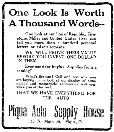
The saying “a picture is worth a thousands words” was first illustrated in this advertisement in Ohio in 1913 in the Piqua Leader-Dispatch newspaper. No photos. Just 94 words. And a nice rounded black border.

Shapes, shapes and more shapes
Back in the early days of the web, a triangle shape would need to be drawn in Photoshop and integrated as an image on page. You can still do that, of course.
But with CSS and JavaScript, we no longer have to draw digital images — it can be done in code. Code renders quickly. It allows for animation and transitions and wonderful hover effects — all features that can be used to control a user’s experience and to highlight, present or showcase content.
Shapes, buttressed by colour, grids, and good art direction can offer more to a website, book, magazine article, or product than photography.
In some cases, a given shape or set of shapes can offer ambiguity and visual poetry that a plain old photograph cannot. In other cases, a shape or shapes can offer clearer insight, offering the visitor assurance.
~~~
Try to design without photography. See what happens and let me know.
I’ve learned that not using photography in my projects can be liberating.
There is tremendous beauty in constraint and redefinition.
Yours,
TypeQuote Updates and Paid Features
A few quick notes.
First, I’ve spent a lot of time working with my developer to refine TypeQuote. It’s come a long way in a short period of time. This is a new website that features one quote by one author every single day. So far, a few months of quotes are published and my goal is to make the relevant to designers (nee artists) and others who may need inspiration or just a tiny little pick-me-up.
You can easily share quotes with others using the little share button on the bottom right. If you want to share on social media, previews should be working across platforms. And if you have a quote you’d like to feature, please let me know by responding to this newsletter.
Second, I would like to offer additional features to paid subscribers to Dear Designer. Right now, this newsletter is entirely free and the vast majority of it will remain that way. But I would like to earn some money from publishing and I have a number of ideas for paid features, including support guides for designers who are struggling, monthly chats with other designers, and workflow insights into how I work.
I’ll have more about this in the fall. But, in the meantime, if there is a paid feature you might like to see, dear designer, please let me know.
Thank you for being a subscriber to Dear Designer. (I recognize that I’m on a bi-monthly schedule instead of a weekly one right now. Summer in Montreal is my only excuse.)
Image of the Week

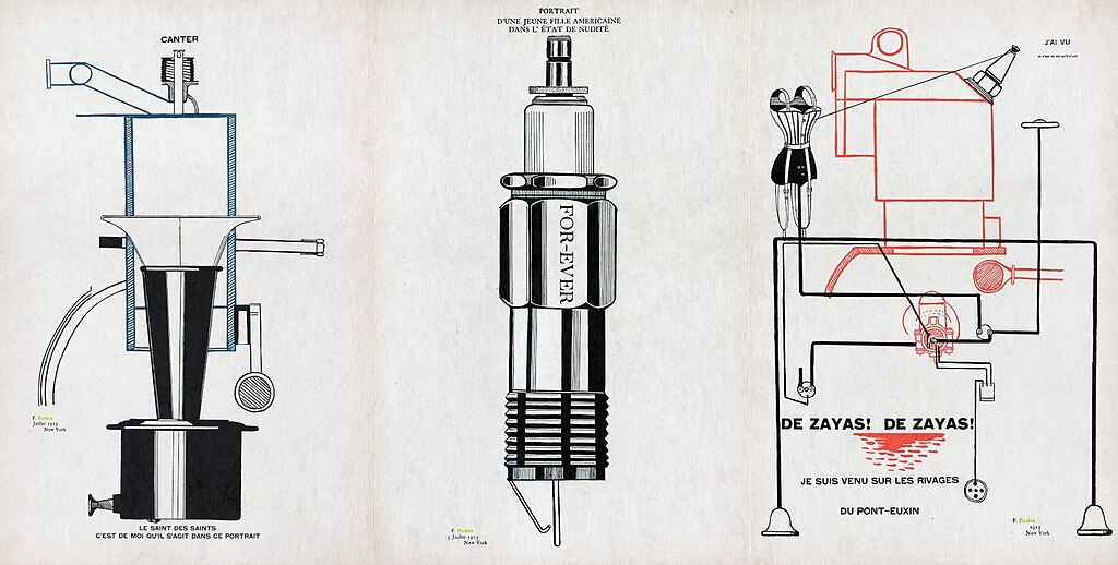
One of my fave artists is Francis Picabia. Born in 1879 in France, Francis-Marie Martinez de Picabia moved between movements fluidly — from Impressionism to Dadaism to Cubism to Surrealism. He did it with panache and joy, poking fun at commercial culture while also writing visual poetry and experimenting with type, painting and drawing and collaging. In this set of drawings from 1915, Picabia diagrams machines that look like they came out of a machinist’s manual but are actually working poems. Strange, delightful and unproductive images that look so, so 2025.
Quote of the Week
The aim of art is to get us to dream, just like music, for it expresses a mood projected onto the canvas, which arouses identical sensations in the viewer.
~ Francis Picabia
Thank you again for subscribing, dear designer. If this newsletter was forwarded, you can get your very own subscription here.
Here is the same button for effect!
You can also share this post with this button.


Really enjoyed this! I’ve just started studying graphic design this year and I’m looking forward to reading some more of your posts ☺️
hey ı am a designer too look at my designs and let me know your thoughts🫶🏻🥹
https://www.instagram.com/nisscreative?igsh=dWN5cHk0djk5aG43&utm_source=qr